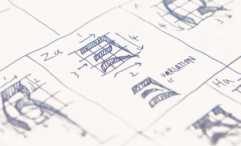
We should note, that what we call fonts are actually typefaces. A typeface is the collection of letters and symbols. A font is how we use that typeface (size, line spacing, things like that). But we're just gonna roll with font, because that makes more sense to non-designers. If you're not a designer, you don't need to be an expert on all the right terms. Ready?
4 Tips for Choosing the Right Font
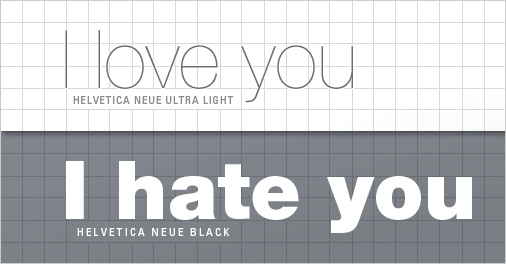
For the average person, the right font is whatever the program picks by default. But when it comes to design, font matters. And when it comes you your business and your brand, it matters most.
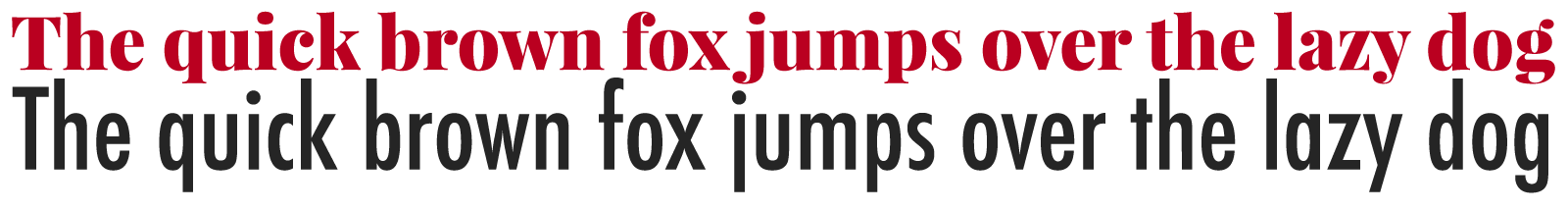
Even the best designs can be ruined by the wrong font, or even good fonts used in the wrong ways. Read on to figure out why fonts matter.