A former-local moved to Denver to find new roots, and started the greatest bakery the world has ever known. But when it came time to develop a strong brand and online presence, she turned to the people she could trust the most. And while it isn't the biggest or flashiest site we've ever done. It's the one that meant the most to us.
Clean and minimal
Simple & elegant
Strong visuals
Online ordering
Website design
Graphic design
UI/UX planning
Wordpress dev
18 months (seriously)
So you noticed the timeframe said 18 months, huh? We'll get to that in a minute, but I wanted to start from the beginning on this one.
For the sake of the story, Sugar Bakeshop owner, Natalie Slevin, is a longtime friend of our Creative Director, Sam. Every time he's in Denver, he's gaining weight at Sugar Bakeshop. Sugar was originally a small booth at the local farmer's market, selling gourmet cupcakes. And when Natalie finally opened a brick-and-mortar store, she already had a loyal following.
Eventually that following began to include some rather important people at the Food Network, who eventually featured Sugar on an episode of Unique Sweets. One holiday season, when Natalie was back home, we began chatting about her website. She'd had it for years, it wasn't mobile friendly, and it wasn't easy for her to keep updated. I promised her we could solve all those problems.
We got started right away on a design, and trying to come up with a color scheme. Eventually we settled on a design, Natalie signed off, and we began building the site. After a couple of months, we had the site finished. We went back and forth with Natalie about our ideas, and trying to get the content just right. And every time it was the same thing: we liked it, but we didn't love it either. We just weren't willing to settle, but we didn't want to let Natalie down either.
One night, after a couple of hours staring at the page, Sam closed his browser, and started from scratch. He wasn't trying to make a new site, just see if he could get some fresh ideas. He designed a mockup of the home page, posted it to his Instagram and Dribbble accounts, and started asking for feedback. And it was unanimous: we had to scrap everything and start over from scratch. And, once again, Natalie agreed.
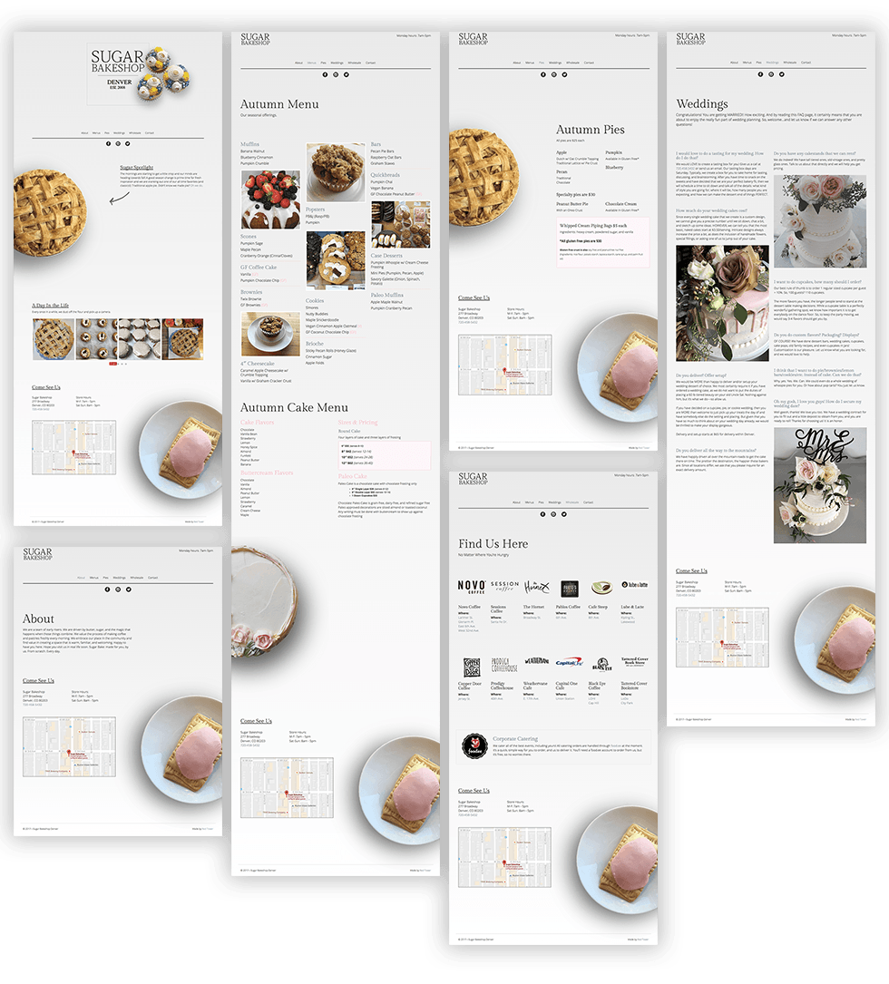
What we came up with we like to describe as "realistic subtlety". Rarely will you find absolute white and absolute black in nature. It's always a million shades in between. So we settled on a very light gradient that appears to cast a natural shadow on the whole page, from barely grey to almost white. We don't use a solid black or a solid white anywhere on the site.
We then chose imagery that fell in that same vein. We took actual photographs of treats from the Sugar kitchen, and we lit them so that the natural highlights and shadows matched up with the natural gradient of the background. And then we kept it all to a stark minimum.
Since nothing in the real world fits directly in our vision, we created a periphery by placing objects "off canvas," which is a fancy term for making objects look like they're partially off the page. And we hand illustrated small details wherever possible to add to the overall natural visuals.
Besides "elegant", one of the main requirements for the site was "simple". That means that anyone and everyone that visits the site needs to be able to find what they're looking for immediately. And the analytics of the site told us that Sugar gets a ton of mobile traffic. So we started with those users first, and worked out to wider screens from there. The end result is a simple and elegant site, and a good user experience, on any and all devices.
When we first presented the concept of the new layout to Natalie, it changed her entire perspective of what her site could be. It was so clean and elegant, she didn't want to clutter it up with a lot of content. Part of the reason it took a solid year-and-a-half was because of the multiple revisions to get it right. And those revisions were intermitently being put on hold because of various busy seasons in the baking industry. Thanksgiving pies, Christmas cookies, Valentine's sweets. We were working around holidays and weddings, and no one was willing to rush anything. This site had to be perfect.
The end result was a collaboration between our minimal design, and Natalie's minimal content. Wherever possible, she kept descriptions short, and even scrapped entire sections of the site that we had in the original design. And when it finally went live, we all knew it was exactly right.
This is a copyright. There's a funnier one on computer screens, but since you're on a phone, you just get this one.